MY REDESIGN WORK
Some products have great UX.
Others have great UI.
Few have both.
I re-envision product pages to achieve a balance of great UI and UX. Here's some of my work.
Follow me on Dribbble at https://dribbble.com/sanarazvi
*P.S. These redesigns were done just for fun in my free time and not for any actual clients.
E-COMMERCE
Zara App
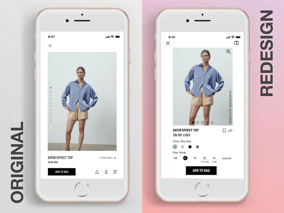
Redesign considerations
- Include most critical content above the fold.
- Scarcity Principle: showing how many products are left motivates buyers to take action.
- Show product options (color) and allow user to see selected options reflected in the product image.
- Allow zoom on images so buyers can see products in detail
- Provide indications of the real world size, fit and quality of the product to help users make purchase decisions. Showing the model's height and size shown in the image provides an indication to the real world size and fit of the product.
- Consistency: Keep the shopping cart in the same place throughout the experience, in the Zara App it is in the top right corner on other pages
Testing Questions
This design required balancing the size of the image such that it's large enough for the user to see it in detail and include the critical content above the fold. A common design assumption is that primary CTAs should be above the fold to promote conversions. A question I would seek to answer through A/B testing is: does having the Add to Cart button above the fold have an impact on product conversions? If the answer is 'no' then I would consider placing the Add to Cart button below the fold and increase the size of the product image.
Bed Bath & Beyond App
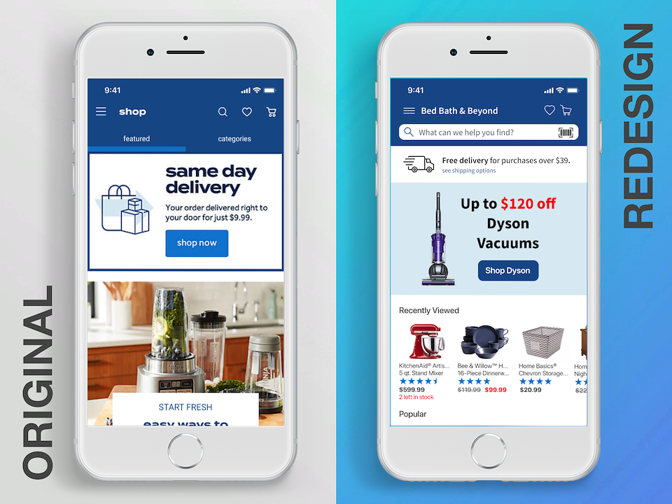
Redesign considerations
- Target persona assumptions: interested in deals but not 'bargain shoppers', many are return shoppers in the app and know what they are looking for
- Include most critical content above the fold.
- Branding: Include brand logo or company name in the header
- Omnipresent search: for users that know what they are looking for.
- Buyers are looking for free shipping, any free shipping offering and purchase limits should be stated immediately. One day or express shipping is expected to be offered at an additional cost, this doesn't provide motivation to buy.
- Scarcity Principle: showing how many products are left motivates buyers to take action.
Testing Questions
We want to predict the buyer's needs and wants through anticipatory design and include types/categories of products that will spark their interest. These categories may include recently viewed, recommended based on past purchases, most popular, etc. A question I would seek to answer through heat map analysis and/or A/B testing is: What categories of items are most successful in promoting purchases?
Dry Goods Mobile Site
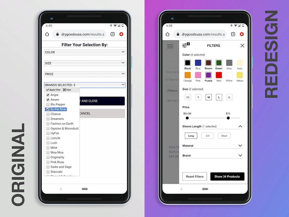
Redesign considerations
- Include most critical content above the fold.
- Faceted navigation: allow users to refine search by multiple filters for characteristics of product desired
- Basic and advanced filters: Show most commonly utilized filters first with options. Advanced or less commonly utilized filters can be collapsed.
- Visibility: Ensure selected options are visibly distinguished from unselected options
- Indicate how many products meet the users filter criteria
- Flexibility: Allow the user to select a custom price range and provide guidance on the lower/upper price limits of products available
- Feedback: show webpage reloading in the background every time the user applies a filter to indicate that it's been applied
Testing Questions
We want to show commonly utilized filters first with options and advanced or less commonly utilized filters afterwards to support the user's task most efficiently. A question I would seek to answer through heat map analysis and/or user session recordings is: Which filters are more commonly utilized? And relatedly, which filters are less commonly utilized?