BRIEF
Visibly provides an online vision testing service for people looking to renew their vision prescriptions and purchase new eyewear. According Visibly hired me as a design consultant to redesign their onboarding flow to address usability issues, adhere to their brand aesthetic and increase conversions by 10%. To achieve these objectives, I completed a UX audit of the onboarding flow, accessibility audit, competitive analysis, usability testing with 5 users, brand analysis, responsive high-fidelity design and prototype. I designed and added components to Visibly's existing styleguide. I met with the product manager and development lead bi-weekly for requirements gathering, status updates, design reviews and implementation discussions. This project was completed part-time in 10 weeks.
Furthermore, I added value to the Visibly online experience by making recommendations on the first-time user experience beyond the onboarding flow I was hired to design. In my UX and competitive audit, I included an evaluation of the landing page and other areas of the website such as the FAQs page. I go beyond the 'scope' of a project when needed to help my clients meet their ultimate objectives.
Sana was thoughtful, thorough, and professional with her work, delivering all components of her projects accurately and on-time. She is willing to approach problems with an open mind and challenge the pre-existing ideas from the organization, making her input invaluable when evaluating design systems and user experiences. I would happily recommend her and hope to work with her again in the future.
David Gwizdala, Product Lead at Visibly
COMPETITIVE ANALYSIS
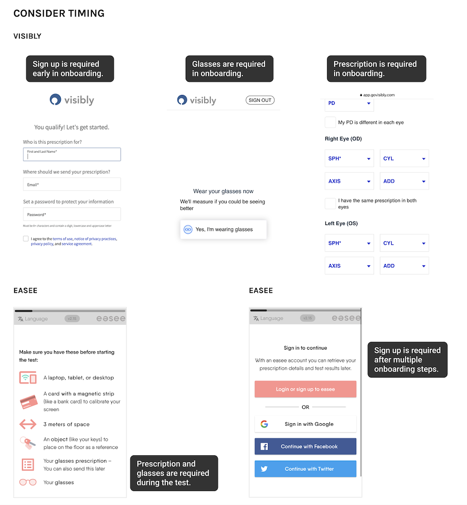
I analyzed 3 direct competitors of Visibly that provide online vision testing and prescription renewal:
- Warby Parker: A mobile app providing online vision testing and prescription renewal.
- 1800 Contacts: A responsive website providing online vision testing and prescription renewal for 1800 Contacts customers.
- Easee: A responsive website providing online vision testing and prescription renewal in Europe.
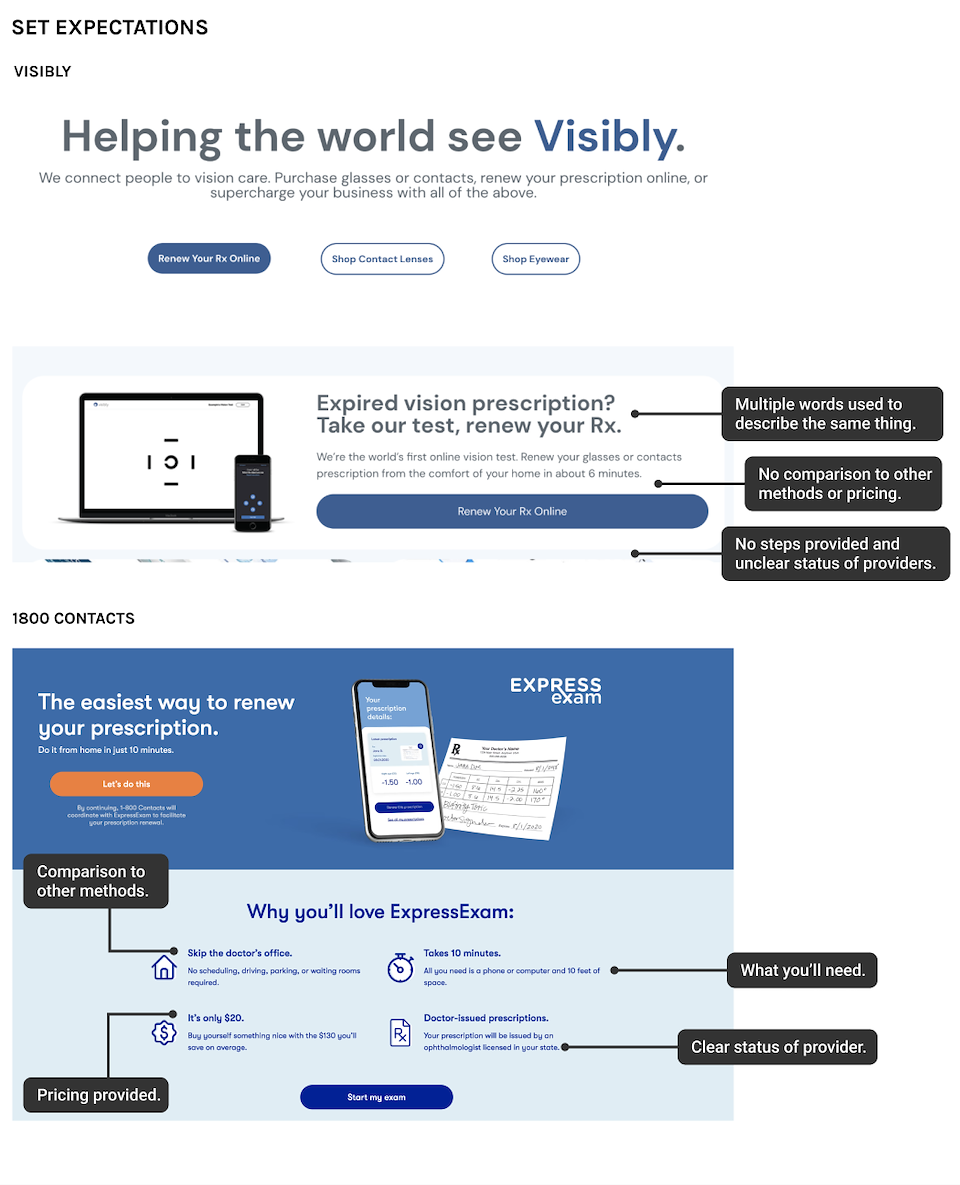
In this competitive analysis and UX audit, I reviewed the information provided to users, onboarding steps, visual design patterns, language, and platforms. The opportunities I identified for Visibly during this analysis are as follows:
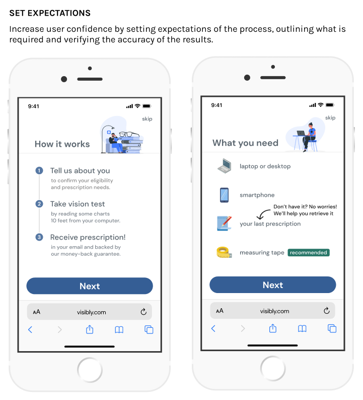
Set expectations: Set expectations of steps in the process and what is required to increase user confidence.
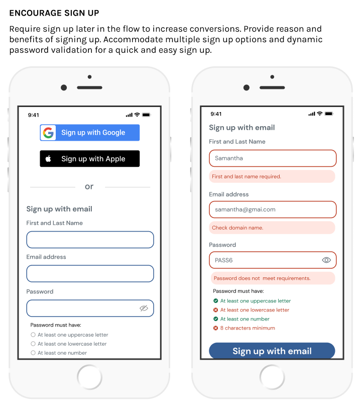
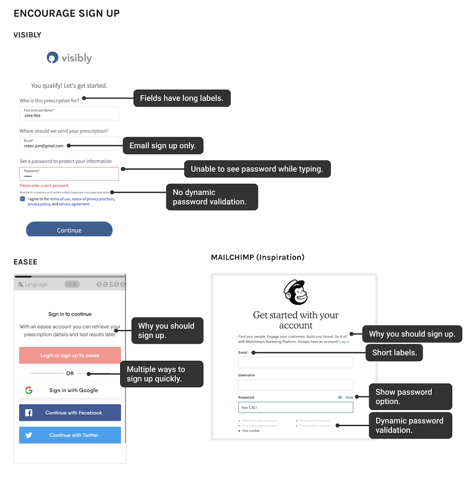
Encourage sign up: Inform the user of the benefits of signing up. Requiring sign up later in the flow may improve conversions. Allowing various login options makes it easier for the user to sign up and log back in.
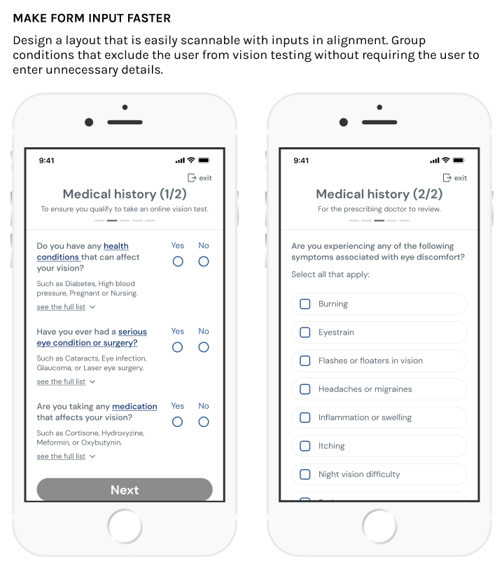
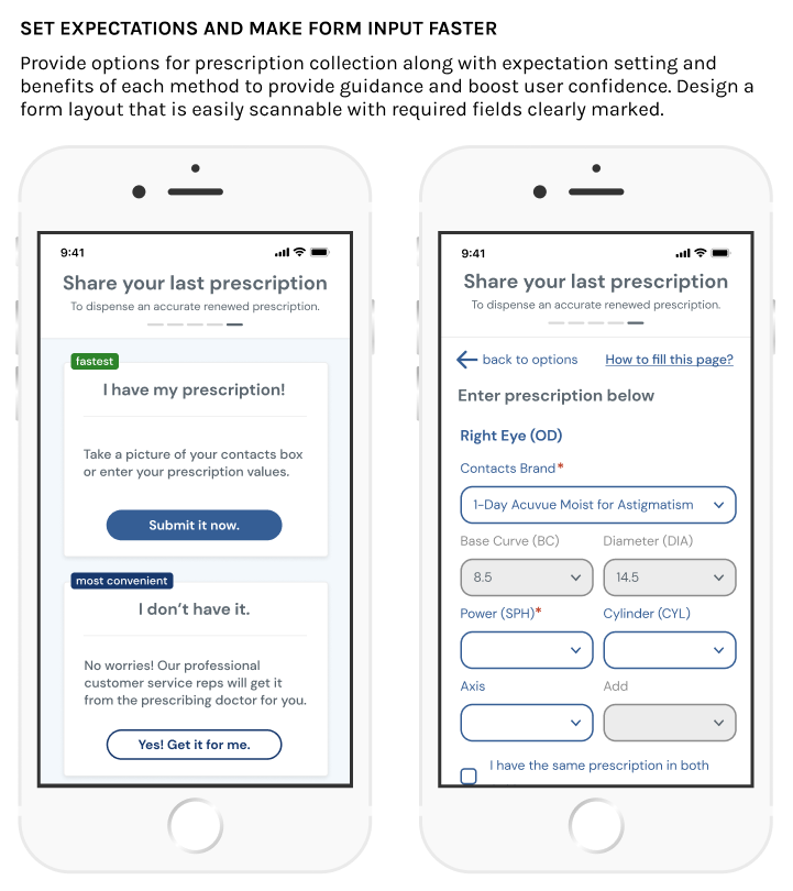
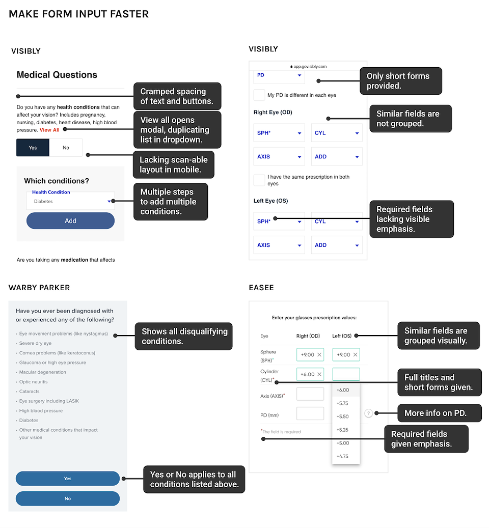
Make form input faster: Select order and layouts that convey meanings faster. Inform user of required and recommended fields. Minimize details and questions not required to continue.
Consider timing What order should the screens appear in? Are there questions that can be asked outside of the onboarding flow?
Following the competitive analysis and UX audit, I proceeded to conduct usability tests on the current Visibly onboarding flow.

USABILITY TESTING
The original scope of the project included interviews with users. I advised Visibly to conduct usability tests instead as the goals of this project were to improve usability and conversation rates. By conducting usability tests of the current onboarding flows, I was able to confirm usability issues and areas that affected the users confidence which prevented them from continuing to complete the vision test. I conducted usability tests with 5 users over Zoom and recorded the sessions.

Usability testing with prescription eyeglass wearers.
The key takeaways and recommendations from the usability testing were as follows:
Takeaway 1: Several users were confused and uninformed about Visibly's online vision testing process. They didn't know what to expect.
Recommendation: Provide steps of the vision testing and prescription renewal process at the start of onboarding. Provide a list of items the users will need to complete to test.
Takeaway 2: Several users doubted the reliability of the technology and credentials of the person reviewing results in order to get an accurate prescription.
Recommendation: Provide confidence in the technology and and credentials of people handling the vision testing. This information would be best provided as a first impression on the landing page, however the terms providing confidence should be repeated in the onboarding where applicable.
Takeaway 3: Some users were held up at the sign up screen as their password did not meet requirements.
Recommendation: Provide methods of sign up other than email and password. Ensure the user can show/hide password and see which password security rules they have met while typing.
Takeaway 4: Several users did not have their prescription on them during the test. They were frustrated at being unable to continue to the test and didn't know what to do next.
Recommendation: Inform the user that a previous prescription is required to continue to vision testing on the landing page and at the start of the onboarding flow. Provide alternate options to the user, indicating the benefits of each option.
Takeaway 5: When users were asked to enter a prescription, they did not notice which fields were required vs. recommended and spent a long time looking for prescription values they did not need to continue.
Recommendation: Provide appropriate emphasis to fields that are required and mark fields that are recommended but not required to continue.
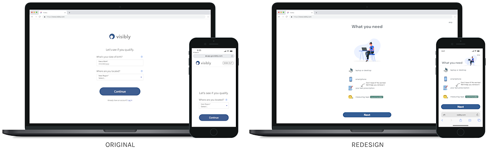
FINAL DESIGN
Before designing the final screens, I had discussions with the product team to determine the brand identity they wanted the product to convey. In reviewing the product website and other artifacts I found the brand identity to be clean, simple and somewhat friendly. The client told me that their solution had to be 'white label' enough to allow their eyewear partner vendors to apply their own branding to them. With all these considerations in mind I used 'DM Sans', a geometric sans font that is a legible body font with a clean, simple and slightly friendly personality. I also used images and iconography that conveyed the brand identity while being white label enough for the partner vendors.
I took a mobile first approach to the final designs starting with iPhone 8 to ensure the forms would be usable across all expected resolutions. I then designed desktop versions and applied constraints to elements as necessary so that developers could manipulate each component to see the responsive behavior. Designs were completed in Figma. All desktop screens can be viewed here and the full mobile prototype can be viewed here. The following are the takeaways from the UX audit, competitive analysis and usability testing that were applied to the final designs.